National Assessment for Educational Progress (NAEP), Reporting Ecosystem

Summary
Client
U.S. Department of Education, National Center for Education Statistics (NCES), National Assessment for Educational Progress (NAEP) program
Project
Design digital reporting product suite, including experience strategy for entire reporting ecosystem
My Roles
Experience design and UX strategy lead from contract onset; data visualization designer; program subject-matter expert; project team leader alongside project managers, technical lead, and account manager.
Impacts
Improved education policymaking, practice research, and professional guidance at multiple levels.
Enhanced news coverage by the New York Times, Washington Post, CNN, and numerous other major, local, and education-specific media outlets.
Improved satisfaction in key audiences and stakeholders in top education policy roles.
Transition of all NAEP reporting to a digital-first approach and maturing of NAEP design processes to be more audience-centered and data-driven
Awards
Communicator Award - Distinction (x2); Vega Award - Arcturus; WebAward - Standard of Excellence
When
2012 to present
Background
Program Goals
NAEP provides a rigorous, ‘gold-standard’ set of measures of U.S. educational achievement, providing education leaders with data to improve policies and practices.
“The National Assessment of Educational Progress (NAEP) provides important information about student achievement and learning experiences in various subjects. Also known as The Nation’s Report Card, NAEP has provided meaningful results to improve education policy and practice since 1969. Results are available for the nation, states, and 27 urban districts.”
“The [2022 NAEP] results show the profound toll on student learning during the pandemic... They underscore the importance of instruction and the role of schools in both students’ academic growth and their overall wellbeing.”
Project Objective
Forum One originally joined the NAEP team in 2012 to provide more engaging, digital reports of NAEP results to supplement other products. Existing reporting wasn’t engaging and relied on Flash.
After helping our prime contractor, ETS, win a new five-year contract, the collective team decided that NAEP reporting should become fully digital. From that point, our team has focused on designing and building a set of reporting products that deliver NAEP data to the program’s target audiences in the form most useful for them to shape improved educational outcomes for U.S. students.
NAEP Audiences
Over the years, we have helped the NAEP team focus on a refined set of target audiences:
Federal-level policymakers, including those in the executive and legislative branches and people in other areas of the Department of Education
State-level policymakers
Education policy influencers, including experts at think-tanks and researchers in academia
Media members covering education issues
Educators, especially administrators
Project Context
Team & Project Structure
The NAEP team consists of numerous representatives from at least seven organizations, as well as multiple levels within NCES and above it in the Department of Education. See below for more about our effective collaboration in this large and complex environment.
ETS is the prime contractor for NAEP reporting and our work supports them as they ultimately produce the assessment data, author the reports, and oversee the technical aspects of the release.
I work within a large, highly collegial and collaborative Forum One team. It includes two project managers, a technical lead and four front- and back-end developers, one-to-three other designers, and two quality assurance professionals.
The NAEP project is of Forum One's largest. It is in year 11, the result of two successful competitive rebids.
Constraints
NAEP has Congressionally-mandated reporting timelines and several layers of sign-offs, so schedule is typically the major deciding factor in the “iron triangle.”
We work with a pre-defined overarching design system and NAEP branding, from which we created our own effective subsystem for the reporting products. Choices can be limited.
Because of the rigorous NAEP review process, once launched, reports are not generally updated. If we find items we want to improve, e.g., in usability testing, we roll changes into subsequent versions.
Approach & Activities
Reports
We typically release two-to-four subject-based report sets per year, with an average timeline of three to five months. Subjects are generally assessed every two (math and reading) or four years (most other subjects).
Report Structures
There are two main report products: Report Cards and Highlights. After studying audiences, considering report content, and considering our process, I spearheaded the move to this structure in 2017. Each product plays a key role:
Report Cards include packaged displays of all core reportable data for a subject. They are designed to provide ready access for those wanting to “deep-dive” into the results. They also provide an efficient way for NAEP to fulfill its reporting mandates. Their structure is mostly evergreen; with a new cycle we only update the data and text explanations.
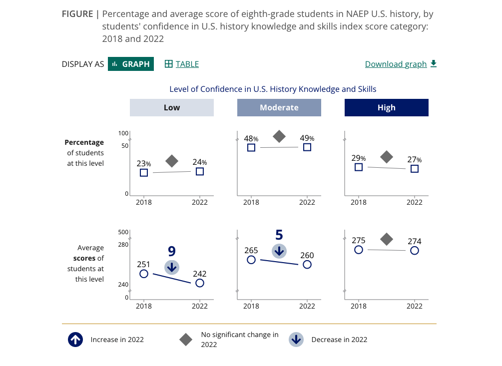
Highlights are unique to each release, condensed (one page with three-to-six major sections), and are deliberately customized for each case. They tell the top stories in the data in a succinct, digestible way. Here we get creative in data displays to highlight particular trends and relationships.
It is clear in the analytics that the Highlights reports are fulfilling their envisioned role of being where the broadest set of audiences go first to get an overview of what is in the latest data, but both products get significant traffic during a release.
Outlining and Design Collaboration
Both the Highlights and Report Cards have established navigation and page structures (though we are always refining them). I led development of the following approach.
We begin by working closely with ETS subject-matter expert authors to understand the data and where we might want to focus the Highlights narrative. Following one-to-two meetings, we engage the NCES team for their feedback and considerations. We often collaborate on report outlines, sometimes in documents, and sometimes on Mural boards.
Again working with our ETS partners and our development team, we determine which existing data visualization and other components we can use as-is to showcase particular pieces of data. We then identify where new variants of existing patterns and even novel presentations would be valuable. For new ideas, true sketching is key. Mural can also be useful to shape structural ideas, including audience journeys. Research and testing insights inform us along the way, as do regular estimates and risk assessments from the development team.
Based on usability test results, and whether it is feasible in the available timeline, we establish what updates are needed in our library of patterns.
Once we know what we need to document for NCES decision-making and/or development needs, we create product and data visualization prototypes (currently Figma).
Examples of recent live report products include: 2024 Math Report Card, Topics in Education: Experiences and Opportunities in Education, 2023 US History Highlights.
Development Collaboration and Support
The reports are built with React and D3. We have worked with the development team and our ETS partners to create more than 40 data visualization and navigation components that we can leverage as we build new reports. Because of our process and technical environment, the site has no true CMS.
We have developed a Kanban project management structure and manage work through Jira. We designers are active in the initial grooming of stories, answering questions, providing updated documentation or design refinements, and reviewing work. Our team is unequivocally characterized by consistently smooth design-development collaboration on tight schedules.
Review and Refinement Facilitation and Stakeholder Management
As products of a government statistical agency, NAEP reports undergo a long, rigorous, highly waterfall review cycle. The first review is led by another one of the partner organizations and involves a minutiae-level review of first draft report products. As the overall report author, the ETS team responds to many comments about stories, language, data. I lead the response to issues related to usability and data visualization. The sessions are always cordial, but we often need to provide additional arguments in favor of decisions that best support our audiences.
Two factors have contributed to my successful participation in these sessions, which includes advocating for my team’s recommended improvements.
To support decisions, I review our strategic framework, provide honest assessments of options, and back my opinions with research and usability testing data.
I highly value the great relationships I’ve developed across this team by knowing its members and the reasons behind different perspectives. I respect others’ knowledge and enjoy injecting some humor into our proceedings.
Challenges
NCES is a government statistical agency which must follow rigorous standards for data display. Most of these standards do ensure clear and accurate presentations. When not, we use evidence to encourage adherence to best practice design strategies while ensuring regulatory compliance.
Many decisions get handed down from senior levels late in the report development process, but we continue to push our research findings “upwards” to help positively influence as many decisions as we can.
NAEP stakeholders tend to request that more and more information be included as the report process moves forward, including dense “governmenty” statements. This conflicts with audience needs, and we continue to try to influence these decisions through education.
Research, Testing, and Analytics
Building a research, testing and analytics program within the NAEP reporting work is one of my prouder achievements on this project. As noted above, it has helped make NAEP decision-making much more audience-centered and deliberate. It has also helped elevate Forum One’s position and role within the NAEP team and solidified trust in our partnership.
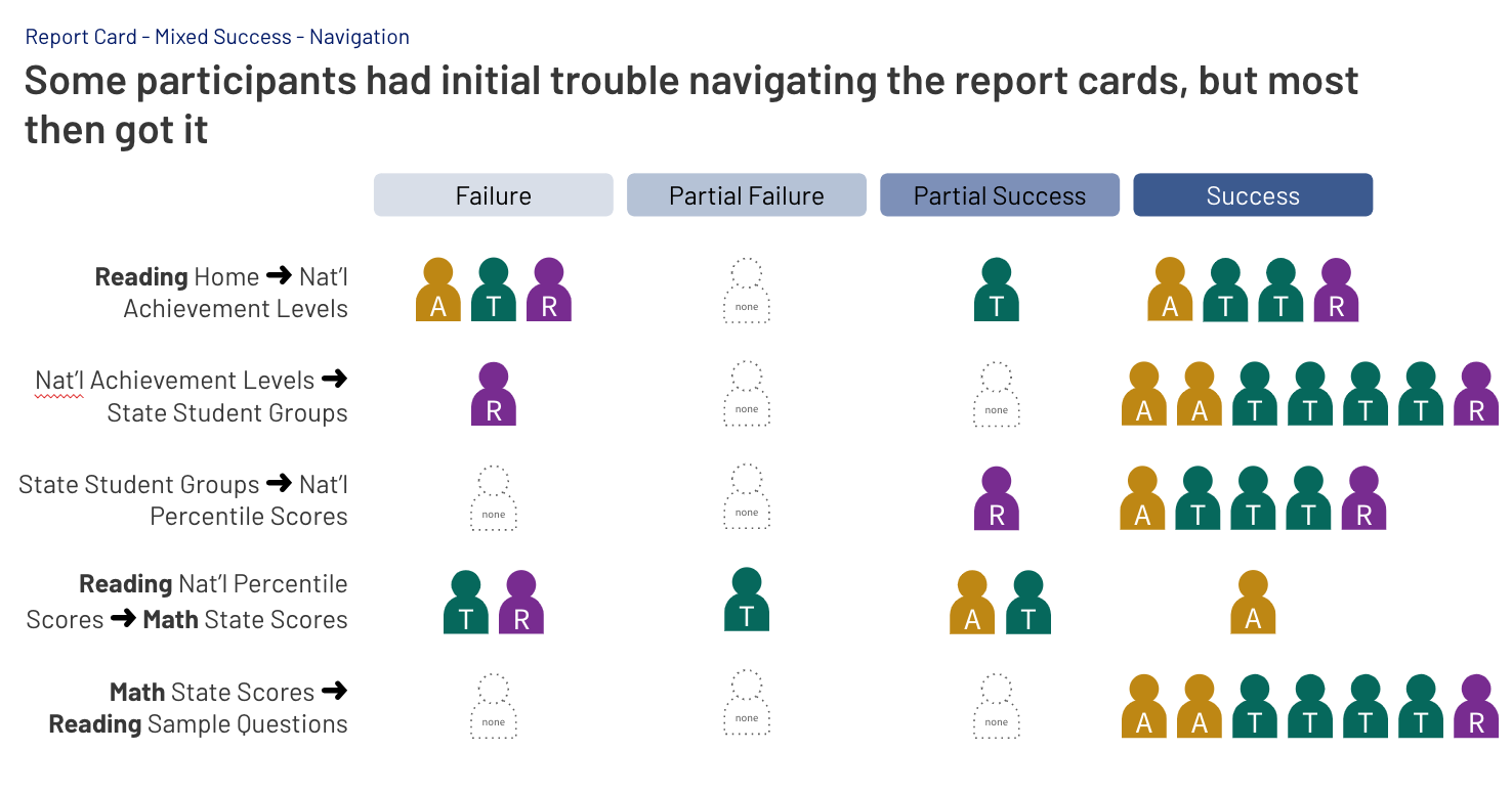
The first two rounds of research and usability testing were helpful, but full of learnings: how to recruit the specialized NAEP audiences, how to navigate the rigid release schedules, and so on. As we did subsequent rounds, we were able to identify ideas that weren’t working in both navigation and visualizations, and ultimately refine our presentations. Some examples are below.
Almost all testing has been remote. We have used tools like UserZoomGO and Zoom to record sessions and allow us to take clips of concrete examples of successes and issues, helping engagement with the process and trust in its conclusions. To date, members of the broader team have not elected to join actual sessions.
Meanwhile, we had to learn what analytics could and couldn’t tell us in a React environment, until we dealt with the underlying limitations of this platform. We were still able to teach the team how to use analytics in new and more powerful ways, not just looking at periodic pageview numbers.
The research, testing and analytics program has now been in place within our workstream for 9 years, and it has led to dozens of insights and enhancements.
Additional research has included interviews and focused surveys.
Challenge
We are confident we are getting helpful feedback from the audiences we can reach - researchers and educators, but recruiting for our specialized target audiences - policymakers and media people - has been a challenge. We continue to pursue additional members to ensure we don’t have blind spots.
Ecosystem
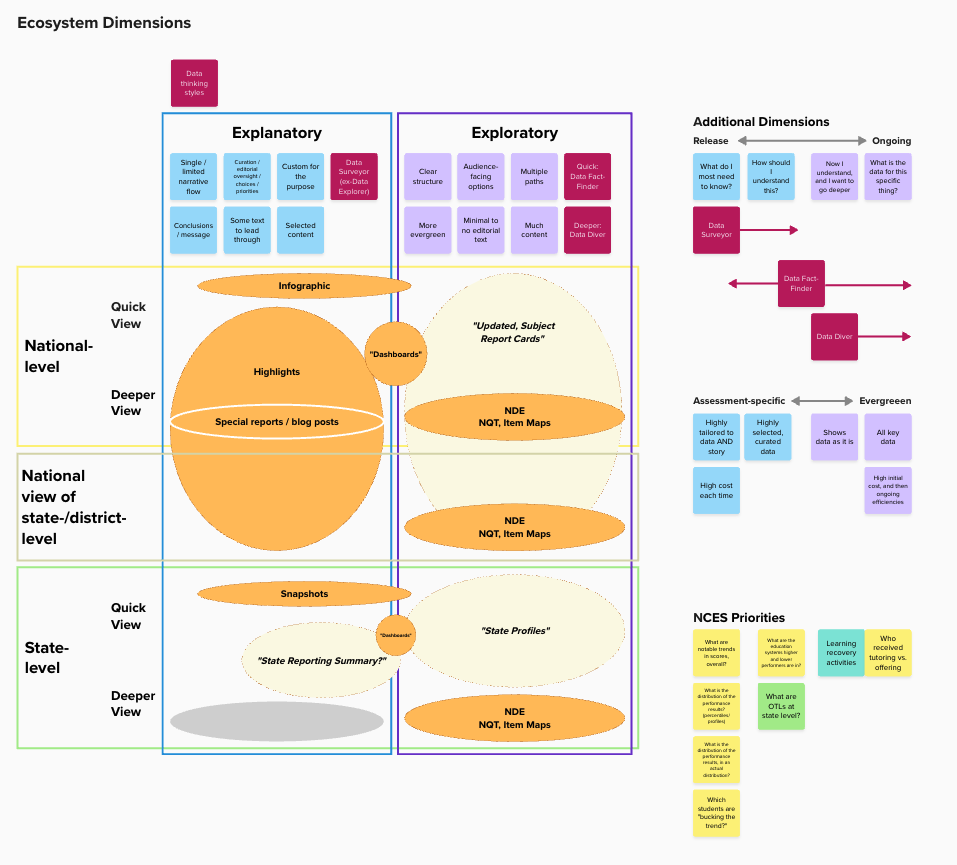
Our reports exist within a broader ecosystem of NAEP reporting and data products. Other elements include the main NAEP results website, NationsReportCard.gov, state and district profiles tools, a custom-made NAEP data query tool, and more. While others manage these other products day-to-day, we have put our research and information architecture skills to use in evaluating the ecosystem as a whole.
It was out of this work that I developed the Report Card / Highlights structure idea. We also used it to rationalize the location of content and tools across NAEP websites, bringing all data and results to NationsReportCard.gov.
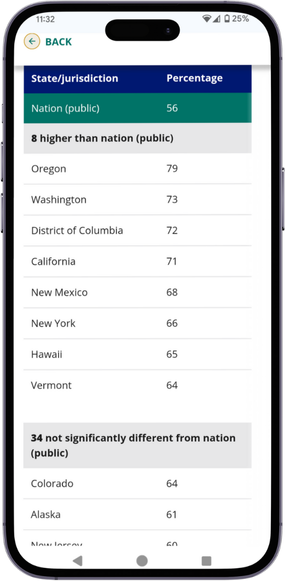
We are currently beginning a second look at the overall ecosystem, studying the set of products that show state data in hopes of rationalizing and/or harmonizing them and creating a more coherent audience experience.
We are currently beginning extensive research to understand how audiences engage with state and district data and the particular products used to access it. I plan to develop journey maps or similar artifacts to continue evolving our products.


